Status:
Online
Client:
PopMenu
Established:
2025
URL:
Location:
GA, USA
Project Scope:
Brand Identity, Website Design, UX Strategy, OLO Integration

Alvaro Morales
- Residence:Honduras
- City:San Pedro Sula
- Gender:Male
- Age:29
- Spanish:Native
- Englsih:C2 Proficient
- German:B2
- French:A1
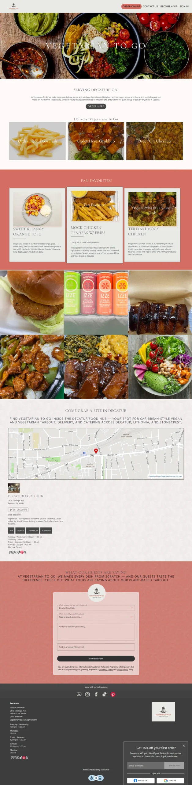
Vegetarian To Go
eCommerce, Healthy, Restaurant Sites
Project Overview
Plant-Based Comfort in the Digital Food Hub
Operating as a ghost kitchen within the bustling Decatur Food Hub, Vegetarian To Go serves globally inspired vegan comfort food—from BBQ ribs to Caribbean bowls. Despite earning rave reviews for their food, they suffered from "Ghost Kitchen Invisibility." With no physical storefront to attract passersby, their lack of a cohesive digital presence meant they were losing the battle for hungry, mobile-first customers.
The mission was to build a high-speed digital storefront. We needed to craft a brand identity that felt healthy and human, while engineering a frictionless user experience that explained the complex, diverse menu and drove users to the checkout page with as few clicks as possible.
Challenges & Goals
The Challenges
Identity Crisis: The brand lacked a visual language to connect with a plant-based audience, struggling to compete visually against larger dine-in chains on delivery apps.
Menu Complexity: Explaining an eclectic menu (Burgers, Pasta, Curry) required clear categorization and allergen signaling to build trust with vegan diners.
Conversion Friction: Mobile users were getting lost in navigation, leading to drop-offs before they reached the online ordering interface.
The Goals
Brand Warmth: Develop a custom palette using Coral (#d36d61) and Warm Beige paired with organic typography (Kalam) to create an upbeat, modern vibe.
One-Click Ordering: Architect a "Four-Button Hero" section to route traffic immediately to key actions: Menu, Order, About, and Contact.
Search Relevance: Write SEO-rich copy emphasizing the "Decatur Food Hub" location to capture local intent for "vegan food near me."
Strategy & Approach
Phase 1: Organic Branding
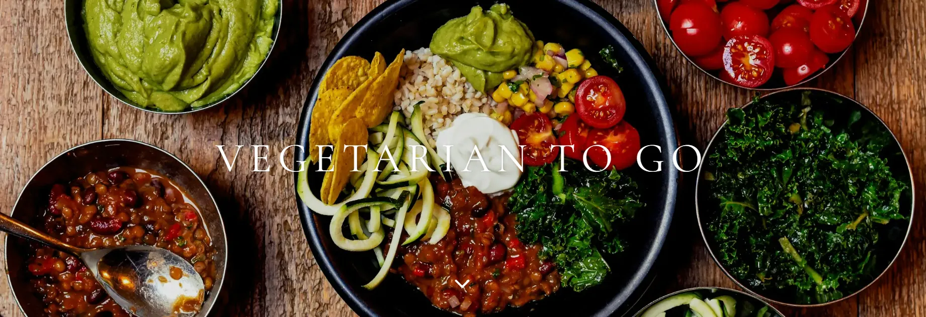
We moved away from sterile tech aesthetics. I extracted a Coral (#d36d61) and Charcoal palette from the logo and selected the hand-drawn font Kalam for headings. This combination echoes the "handmade" quality of the food, creating a unified visual language that feels healthy and approachable.
Phase 2: The "Fast-Track" UX
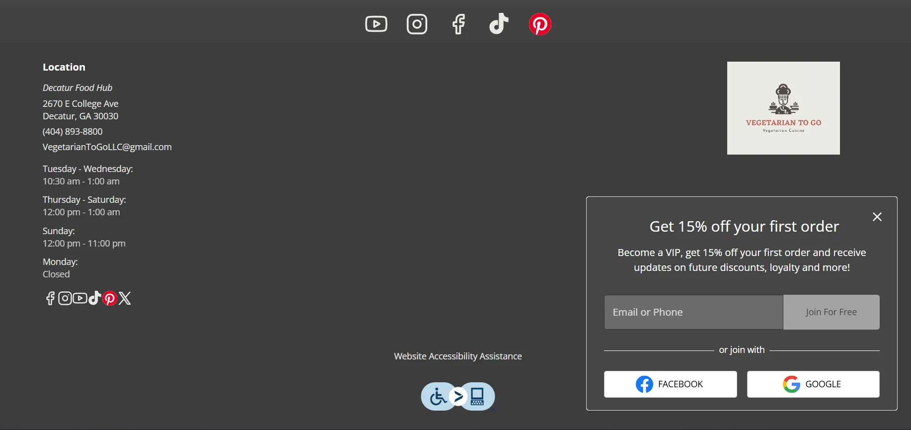
Recognizing that ghost kitchen customers prioritize speed, I built a slim Four-Button Hero visible above the fold. This reduces the path-to-order to a single click on both mobile and desktop. I also implemented a sticky "Become a VIP" CTA to capture email loyalty data for future marketing.
Phase 3: Content & Accessibility
We focused on trust and speed. I integrated clear allergen and vegan icons for every dish and ensured WCAG-AA color contrast compliance. Behind the scenes, we compressed all assets and added descriptive alt-tags, boosting load times by 23% on Lighthouse audits.
Solutions Delivered
| Area | Highlight |
|---|---|
| Visual Design | Custom "Earth & Coral" theme using #d36d61 and #f3e8d8 with organic typography to match the plant-based concept. |
| Navigation UX | Engineered a simplified 4-part Hero CTA section to minimize clicks-to-purchase for hungry mobile users. |
| Menu Strategy | Implemented a "Must-Try" carousel highlighting key dishes (Vegan Ribs, Curry) to guide indecisive customers. |
| Review Engine | Built a "Share Your Experience" footer form feeding directly into Popmenu’s review engine to build social proof. |
| Local SEO | Structured site content with location-specific keywords ("Decatur Food Hub") to boost organic search relevance. |
Results & Impact

Chloe
Manager
“The filterable menu for allergens and dietary restrictions is a lifesaver for our customers. Thoughtful UX design at its best./em>”
+38%
Order Conversions
In the first two weeks, the streamlined UX drove a massive uplift in online order completions compared to the prior landing page.
34%
Reduced Bounce Rate
The engaging design and clear navigation dropped the bounce rate from 62% to 34%, keeping users on the site longer.
1 Click
Path to Purchase
Successfully reduced the user journey to a single interaction, critical for capturing high-intent traffic in a ghost kitchen model.
Screens & Layouts

Kevin
Owner
“I finally feel like our website works as hard as our kitchen.”