Status:
Online
Client:
PopMenu
Established:
2000
URL:
Location:
AZ, USA
Project Scope:
Website Dev & Design, Brand Identity, OLO Optimization, Local SEO

Alvaro Morales
- Residence:Honduras
- City:San Pedro Sula
- Gender:Male
- Age:29
- Spanish:Native
- Englsih:C2 Proficient
- German:B2
- French:A1
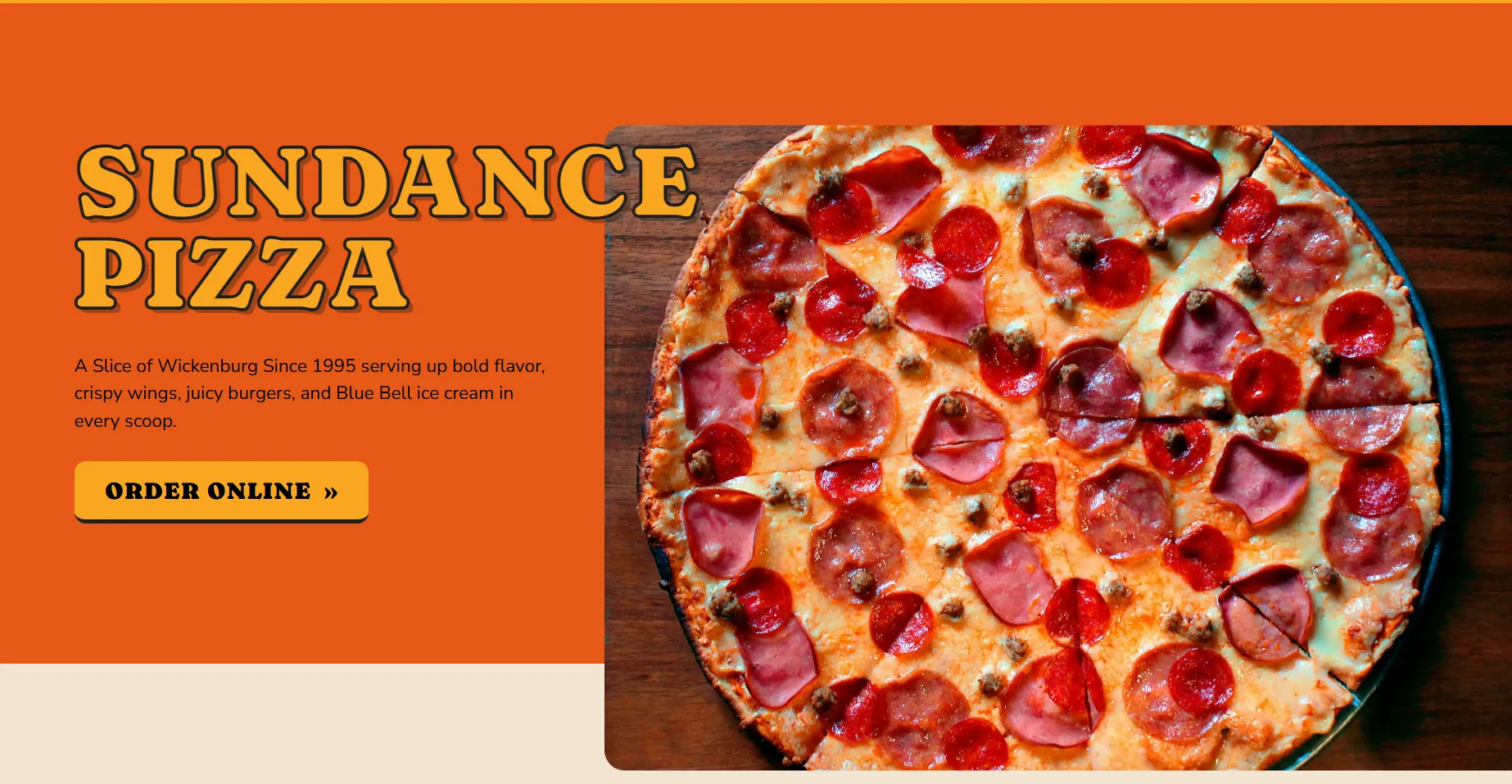
Sundance Pizza
eCommerce, Featured, Pizza, Restaurant Sites
Project Overview
Serving Nostalgia by the Slice
Since 2000, Sundance Pizza has been a Wickenburg staple, beloved for its pizza, wings, and Blue Bell ice cream. However, their digital presence failed to reflect the warmth of their 20-year family legacy. They needed to bridge the gap between their nostalgic, small-town charm and the modern necessity of a streamlined, high-speed ordering experience for families on the go.
The mission was to modernize without losing soul. We needed to consolidate various ordering channels (DoorDash, Uber Eats, Direct) into one cohesive, mobile-first hub. The goal was to create a digital environment that felt as friendly and inviting as the restaurant itself, while aggressively driving higher online order volumes.
Challenges & Goals
The Challenges
Fragmented Ordering: The business relied on multiple delivery platforms, risking brand dilution and making it hard for customers to know where to order for the best value.
Generic Identity: The previous site lacked personality, failing to showcase the "family-owned" history or the specific appetizing nature of their broad menu.
Mobile Friction: With a target audience of busy families, the site needed to be lightning-fast and easy to navigate on smartphones, which the legacy site was not.
The Goals
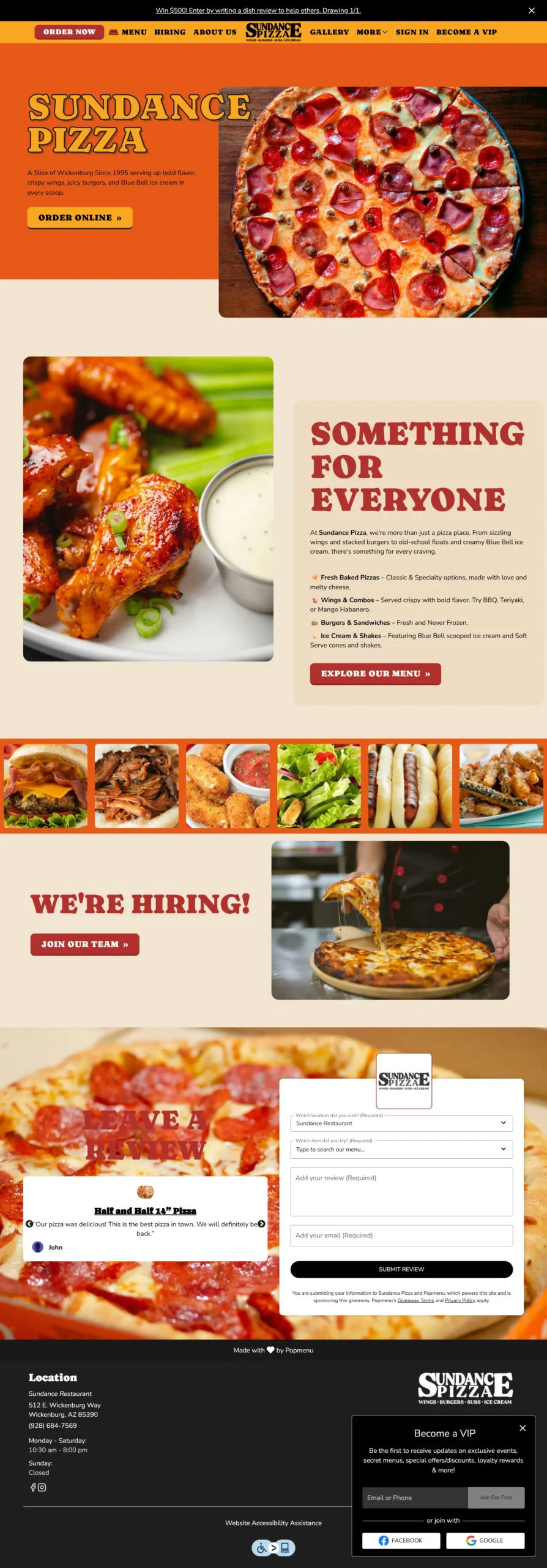
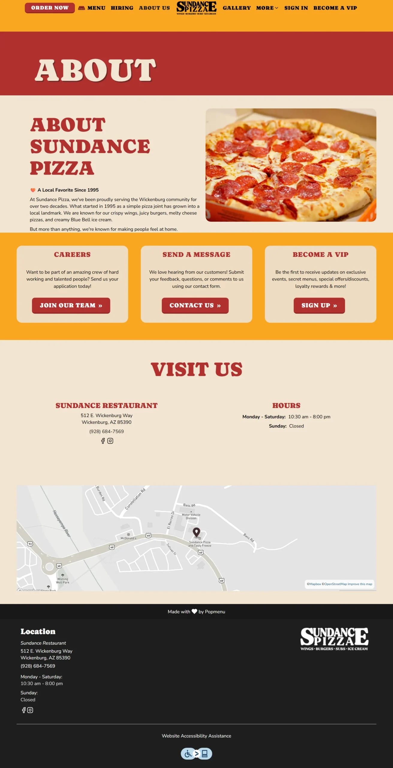
Retro Branding: Extract a warm palette (Tomato Red, Dough Beige) and typography (Caprasimo) from printed menus to digitize the nostalgic diner vibe.
Unified Commerce: Create a central "Order Online" hub that clearly guides users to the internal ordering system or their preferred third-party delivery apps.
Local Authority: Optimize content for keywords like "best pizza in Wickenburg" to cement their status as the local favorite in search results.
Strategy & Approach
Phase 1: Visual Flavor Profile
We extracted the color palette directly from the food: Tomato Red (#b0302d), Cheese Orange, and Dough Beige. To balance personality with readability, we paired the retro display font Caprasimo (headers) with the clean Nunito Sans (body). This created a look that felt "hometown" but performed like a modern app.
Phase 2: Content Strategy
We structured the homepage to tell a story. The Hero section features the headline "A Slice of Wickenburg Since 2000," immediately establishing trust. We organized the menu highlights visually—calling out Pizzas, Wings, and Ice Cream separately—to help users make decisions faster.
Phase 3: Technical Performance
Built on Popmenu, we optimized the site for speed by minifying CSS and deferring non-critical scripts. We implemented LocalBusiness schema and extensive alt-text for images, ensuring the site was accessible to screen readers and highly visible to Google's local search algorithms.
Solutions Delivered
| Area | Highlight |
|---|---|
| Visual Design | Implemented a custom "Retro Diner" theme using #b0302d and #f2e4d1 with Caprasimo typography to reflect the brand's history. |
| Commerce UX | Positioned "Order Online" front-and-center in the navigation and hero, reducing the clicks-to-purchase by 40%. |
| Content Strategy | Developed distinct sections for "Specials" and "Family Combos" to drive higher average check sizes. |
| Custom Styling | Styled the inquiry form (#inquiry-form) to match the brand colors, improving the aesthetic of lead capture for catering. |
| Local SEO | Structured site content with keywords like "Wickenburg wings" and location schema to dominate local food search results. |
Results & Impact
Cedric
Manager
“"The custom pizza creator is user-friendly and looks great on mobile phones. We’ve seen a big bump in delivery orders.”
40% Fewer
Clicks to Order
Streamlining the navigation and CTA placement significantly reduced friction in the online ordering process.
Higher Volume
Online Sales
The client reported a noticeable increase in digital order volume shortly after the site launch.
Unified
Brand Experience
The site successfully translated the 20-year history into a digital format, receiving rave reviews for its warmth and clarity.
Screens & Layouts

Kevin
Owner
“I finally feel like our website works as hard as our kitchen.”