Status:
Online
Client:
PopMenu
Established:
2025
URL:
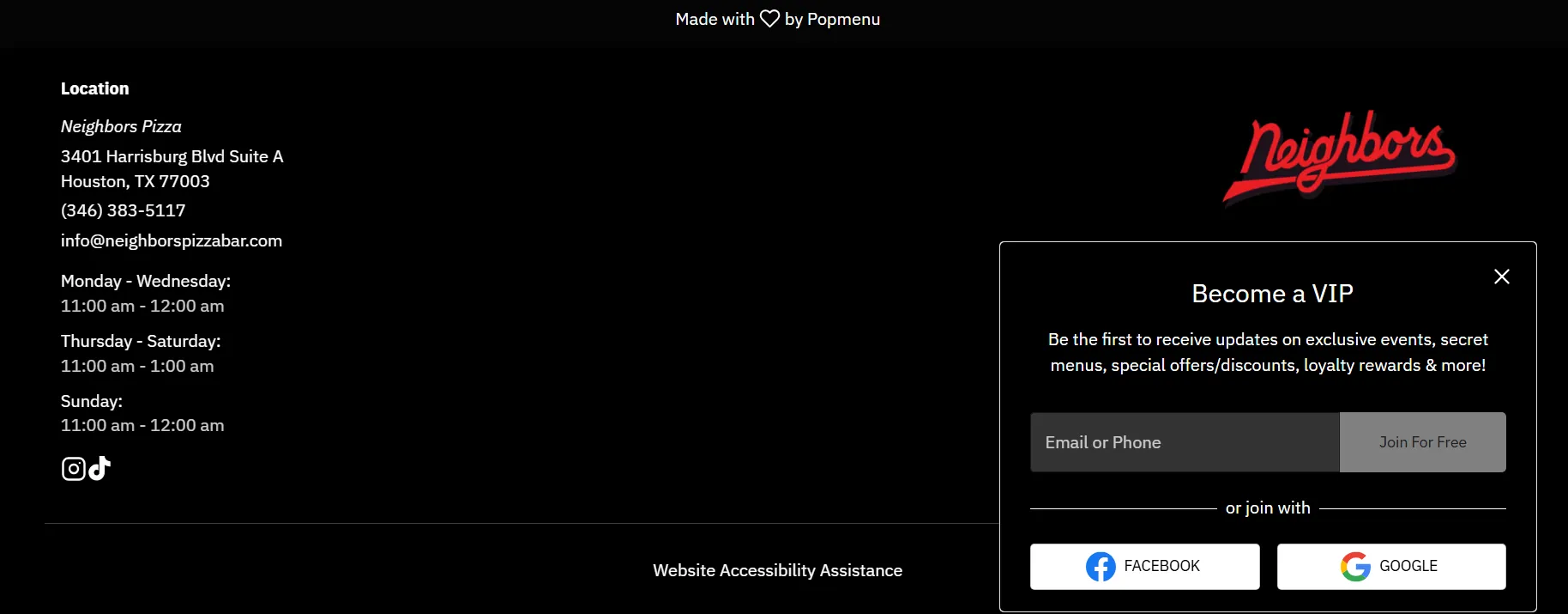
Location:
TX, USA
Project Scope:
Website Dev & Design, Brand Identity, Local SEO, Mobile UX Strategy

Alvaro Morales
- Residence:Honduras
- City:San Pedro Sula
- Gender:Male
- Age:29
- Spanish:Native
- Englsih:C2 Proficient
- German:B2
- French:A1
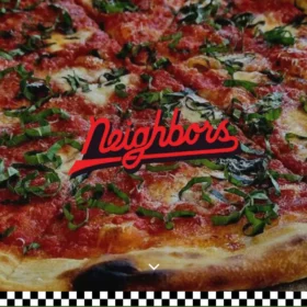
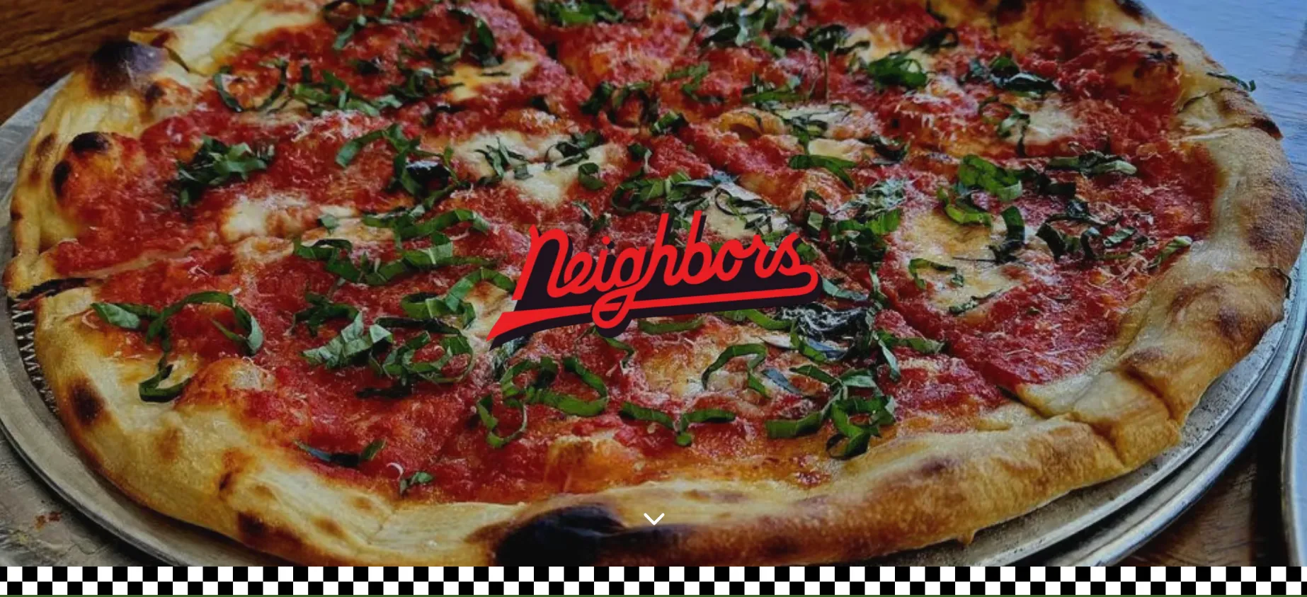
Neighbors
eCommerce, Pizza, Restaurant Sites
Project Overview
From Sunrise Espresso to Midnight Slices
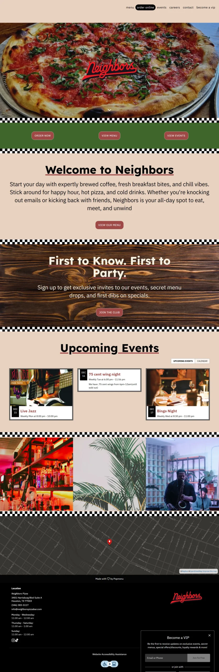
Neighbors acts as the "living room" of Houston’s Second Ward, shapeshifting from a cozy coffee shop by day to a vibrant pizza bar by night. However, their digital presence was stuck in "night mode." The existing website was dark and moody, perfect for cocktails but alienating to the morning crowd seeking wifi and breakfast. With 70% of traffic coming from mobile, the brand needed a platform that could handle this dual identity without confusing the user.
The mission was to build a digital chameleon. We needed to architect a website that felt equally inviting at 8:00 AM and 8:00 PM, balancing a retro "diner" aesthetic with modern functionality to drive daytime traffic and streamline the late-night rush.
Challenges & Goals
The Challenges
Identity Conflict: The brand needed to appeal to two distinct audiences (Morning Coffee vs. Nightlife) without causing cognitive dissonance or navigation clutter.
Mobile Dominance: With over 70% of users on smartphones, the complex menu and event calendar had to be "thumb-friendly" and lightning-fast.
Daytime Invisibility: The previous dark aesthetic was hurting breakfast discovery, leading to missed revenue opportunities in the AM daypart.
The Goals
Visual Balance: Introduce a softer palette of Off-Whites and Butter Yellows to brighten the daytime appeal while keeping the Vivid Red for evening energy.
Local SEO: Structure content to rank simultaneously for "coffee shop Second Ward" and "late-night pizza Houston."
Retro Modernity: Implement custom CSS features like checkered borders to capture the "living room" vibe without using heavy, slow-loading images.
Strategy & Approach
Phase 1: Brand Duality
We moved away from the monolithic dark theme. By pairing Great Vibes (retro script) with IBM Plex Sans (modern body), and introducing Butter Yellow (#fffce0) backgrounds, we created a visual language that feels like a sunny breakfast spot that transitions naturally into a cool evening hang.
Phase 2: The "Split-Screen" UX
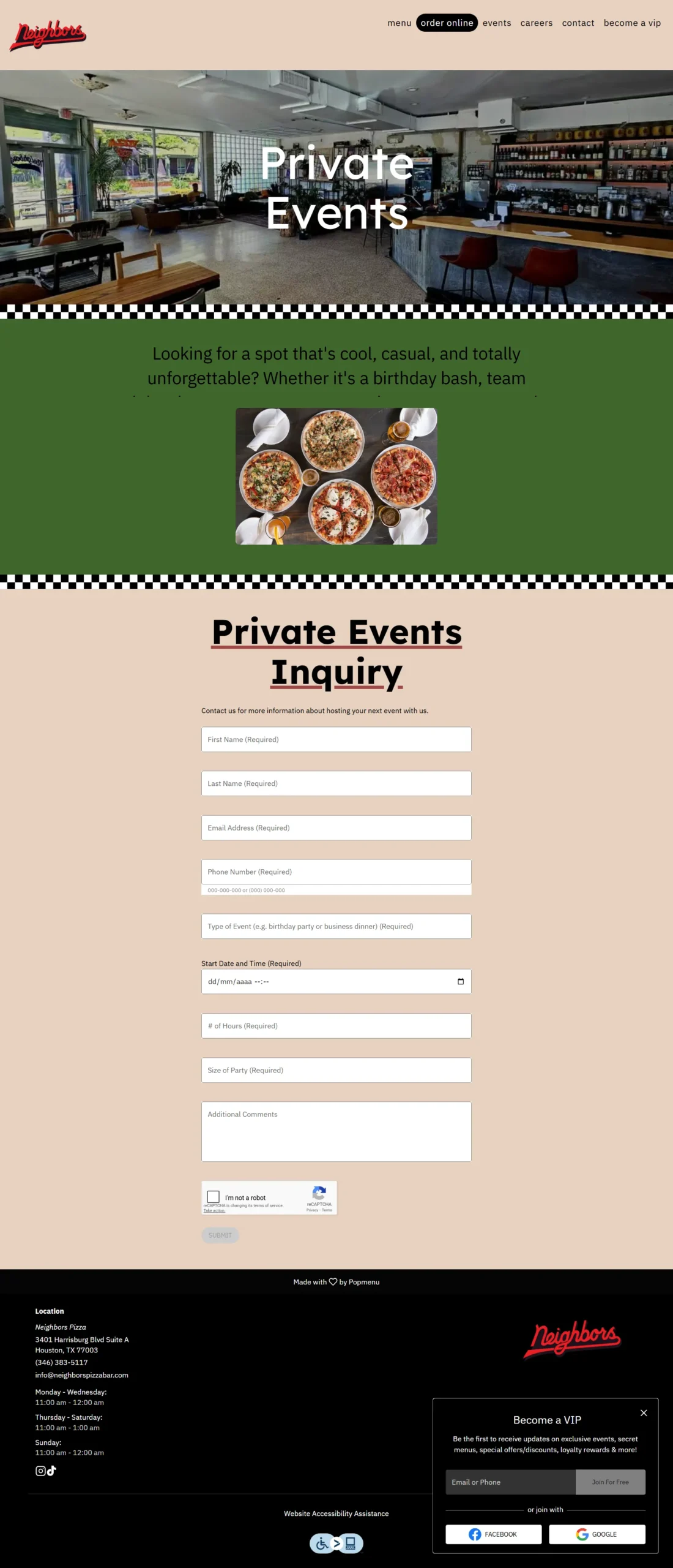
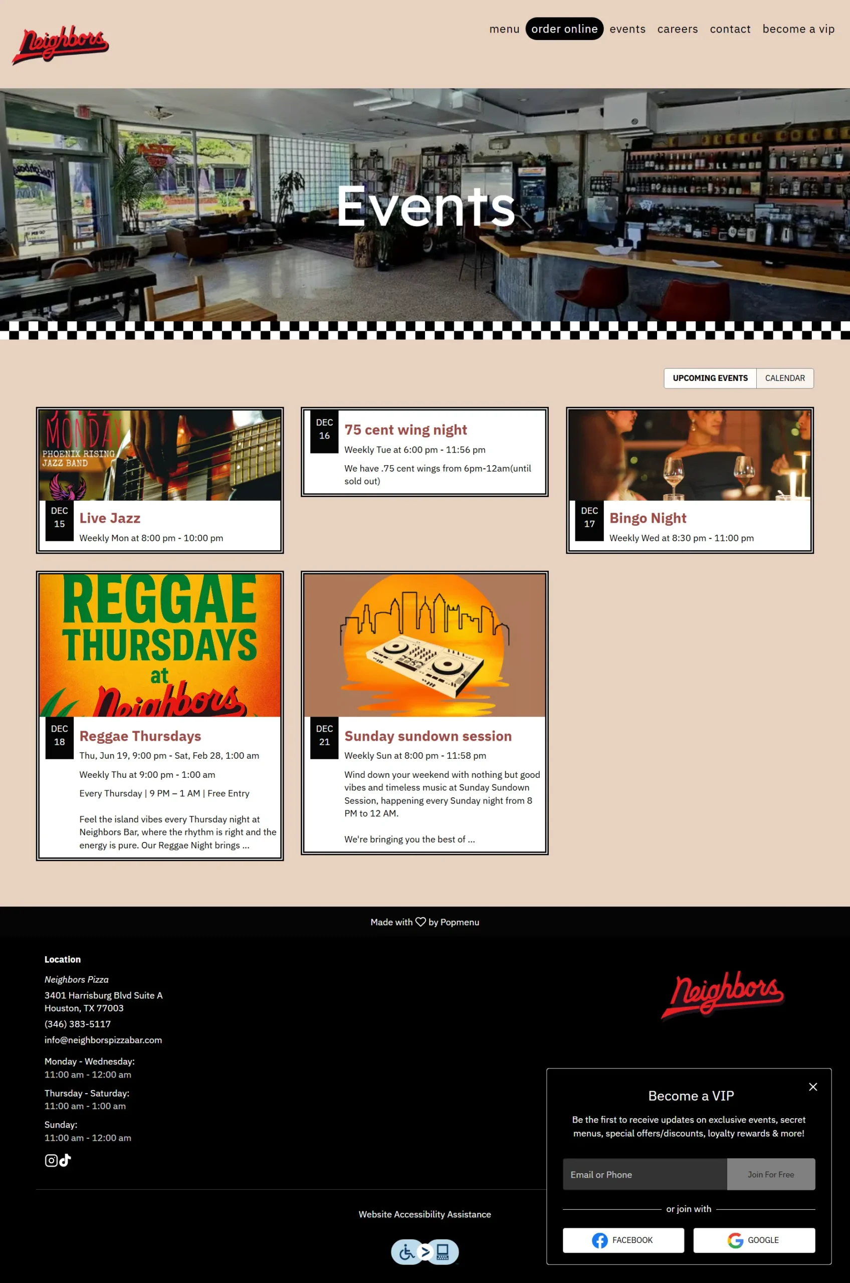
To solve the identity crisis, we engineered a Dual Identity Block on the homepage. This side-by-side panel design clearly signposts "Mornings at Neighbors" (Coffee/WiFi) against "Evenings at Neighbors" (Pizza/Cocktails), allowing users to self-select their experience immediately.
Phase 3: Mobile-First Code
We didn't just shrink the desktop site; we rebuilt it for touch. We used flexible CSS units and media queries to ensure the custom retro tile patterns and call-to-action strips wrapped gracefully on mobile devices. We also implemented lazy-loading for the event carousel to keep load times under 2 seconds on 4G networks.
Solutions Delivered
| Area | Highlight |
|---|---|
| Visual Design | Implemented a custom "Retro Living Room" theme with CSS-generated checkered borders and a responsive off-white/red palette. |
| User Navigation | Created a "Dual Identity" homepage structure that distinctively routes Morning vs. Evening traffic to the correct menus. |
| Event Integration | Built a dynamic "Upcoming Events" preview with a three-card layout to drive attendance for Jazz and Bingo nights. |
| Local SEO | Structured headings and LocalBusiness schema to target dual keywords ("Coffee" and "Pizza") within the Second Ward geo-fence. |
| Lead Generation | Integrated a "Become a VIP" SMS/Email signup form offering first-order incentives to build a loyal community database. |
Results & Impact
Brandon
Manager
“The community board feature helps us stay connected with the neighborhood. It feels like a digital extension of our patio.”
+35%
Daytime Orders
The strategic brightening of the site and clear "Morning" signposting drove a massive uptake in breakfast and coffee sales within two weeks.
+22%
Mobile Conversions
Responsive design adjustments and thumb-friendly CTAs significantly reduced cart abandonment on smartphones.
550+
New Subscribers
The integrated VIP form rapidly expanded the marketing list in the first month, fueling future event attendance.
Screens & Layouts

Kevin
Owner
“I finally feel like our website works as hard as our kitchen.”