Status:
Online
Client:
PopMenu
Established:
2023
URL:
Location:
NY, USA
Project Scope:
Website Redesign, Brand Strategy, Content Writing, OLO Integration

Alvaro Morales
- Residence:Honduras
- City:San Pedro Sula
- Gender:Male
- Age:29
- Spanish:Native
- Englsih:C2 Proficient
- German:B2
- French:A1
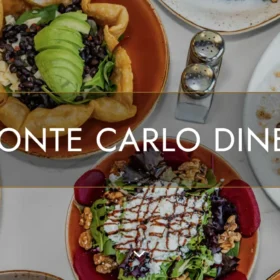
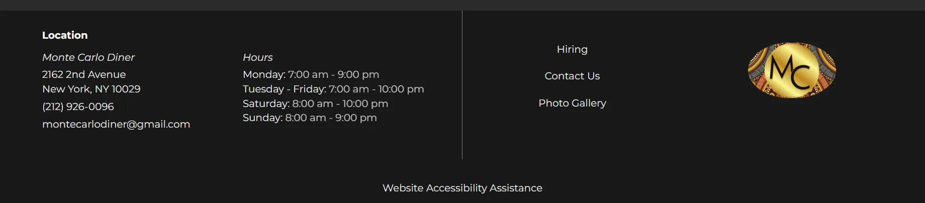
Monte Carlo Diner
Breakfast, Dinner, eCommerce, Restaurant Sites
Project Overview
Elevating the Upper East Side Diner Experience
Opening its doors in 2023, Monte Carlo Diner aimed to bring a refined, upscale-casual brunch experience to Manhattan's Upper East Side. However, their existing digital presence was a stark contrast to their food; the site was cluttered, difficult to navigate, and failed to communicate the brand's "refined diner" aesthetic. With high-quality photography on the way but no coherent layout to house it, the business was missing critical opportunities to convert neighborhood foot traffic into loyal patrons.
The mission was to align the digital experience with the physical ambiance. We needed to create a clean, minimalistic web presence that utilized a sophisticated visual language to strengthen brand visibility and aggressively drive online ordering through a streamlined user journey.
Challenges & Goals
The Challenges
Visual Clutter: The previous site was disorganized and lacked a visual hierarchy, causing user friction and high bounce rates.
Brand Disconnect: The elegant gold-accented "MC" logo clashed with the generic website design, failing to convey the "upscale" part of the diner's identity.
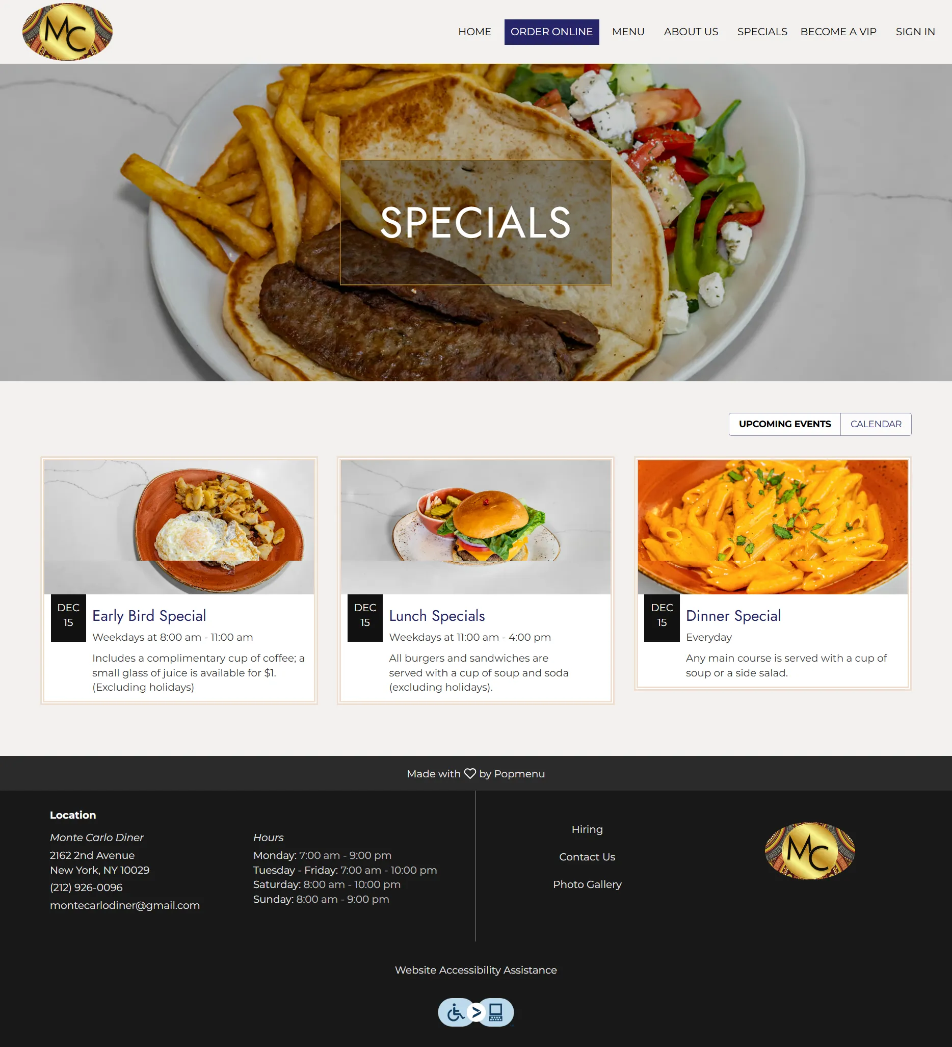
Passive Conversion: Online Ordering (OLO) was buried in the navigation, resulting in lost revenue from takeout customers.
The Goals
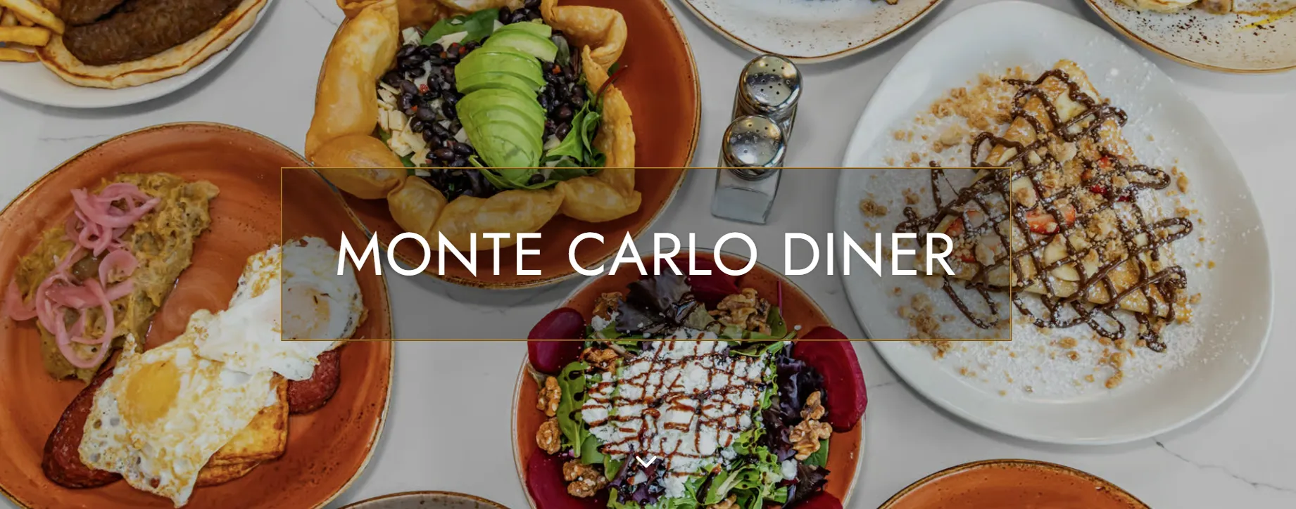
Luxurious Aesthetic: Implement a palette of Navy, Cream, and Gold to reflect the Upper East Side location, paired with Cinzel typography for a touch of class.
Action-Oriented UX: Restructure the homepage with three primary Calls-to-Action (CTAs)—Order, Menu, Specials—to satisfy user intent immediately.
Content Strategy: Rewrite all site copy to be SEO-rich and persuasive, positioning the restaurant as a modern take on the classic diner.
Strategy & Approach
Phase 1: Brand & Competitive Analysis
We studied aspirational venues like The Annie Houston to define an "elevated brunch" aesthetic. We extracted a sophisticated palette—Navy (#262468), Cream (#EFDDCD), and Gold (#C18C2C)—to bridge the gap between the logo and the web interface.
Phase 2: Visual & Content Strategy
To balance luxury with readability, we paired the logo-inspired Cinzel font for headers with the clean Montserrat for body copy. We developed SEO-rich content for every section, ensuring the "About" and "Menu" pages told a cohesive story about the brand's modern approach to comfort food.
Phase 3: Implementation & Integration
Using Popmenu’s CMS, we built a responsive framework that prioritizes mobile users. We integrated Grubhub directly into the navigation to streamline the takeout experience and utilized custom CSS to apply the new brand identity site-wide, ensuring the site was ready to intake professional photography seamlessly.
Solutions Delivered
| Area | Highlight |
|---|---|
| Visual Design | Implemented a custom Gold and Navy theme with Cinzel typography to create a "Gatsby-esque" modern diner feel. |
| Navigation UX | Built a lean sitemap focused on core revenue drivers, featuring three primary CTAs above the fold for immediate user action. |
| Commerce Integration | Seamlessly linked Grubhub to the site navigation, reducing the clicks required to place a delivery order. |
| Content Strategy | Crafted compelling, keyword-optimized copy for the "About" and "Menu" sections to boost local SEO visibility. |
| Scalability | Structured the Popmenu gallery and menu modules to allow the client to easily swap in new assets without developer aid. |
Results & Impact
Carlos
Manager
“You modernized our look without losing the classic diner charm. The mobile optimization is perfect for tourists on the go.”
Unified Brand
Visual Identity
The consistent use of the Gold/Navy palette successfully elevated the digital perception of the brand to match the physical venue.
Improved Flow
Higher CTR
Simplified navigation and prominent homepage CTAs noticeably increased click-through rates to the ordering platform.
Operational Ease
Self-Sufficient
The client now manages menu updates and photo swaps independently, reducing ongoing maintenance costs and time.
Screens & Layouts


Kevin
Owner
“I finally feel like our website works as hard as our kitchen.”