Status:
Online
Client:
PopMenu
Established:
2025
URL:
Location:
CA, USA
Project Scope:
UX/UI Design, Brand Strategy, OLO & Reservation Integration, SEO

Alvaro Morales
- Residence:Honduras
- City:San Pedro Sula
- Gender:Male
- Age:29
- Spanish:Native
- Englsih:C2 Proficient
- German:B2
- French:A1
Mare E Monti
eCommerce, Featured, Italian Food, Restaurant Sites
Project Overview
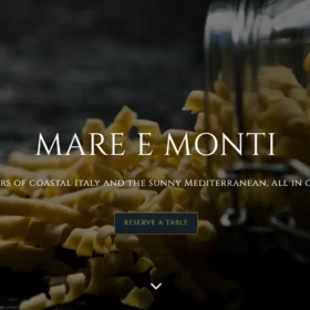
Merging Sea and Mountain in West Hollywood
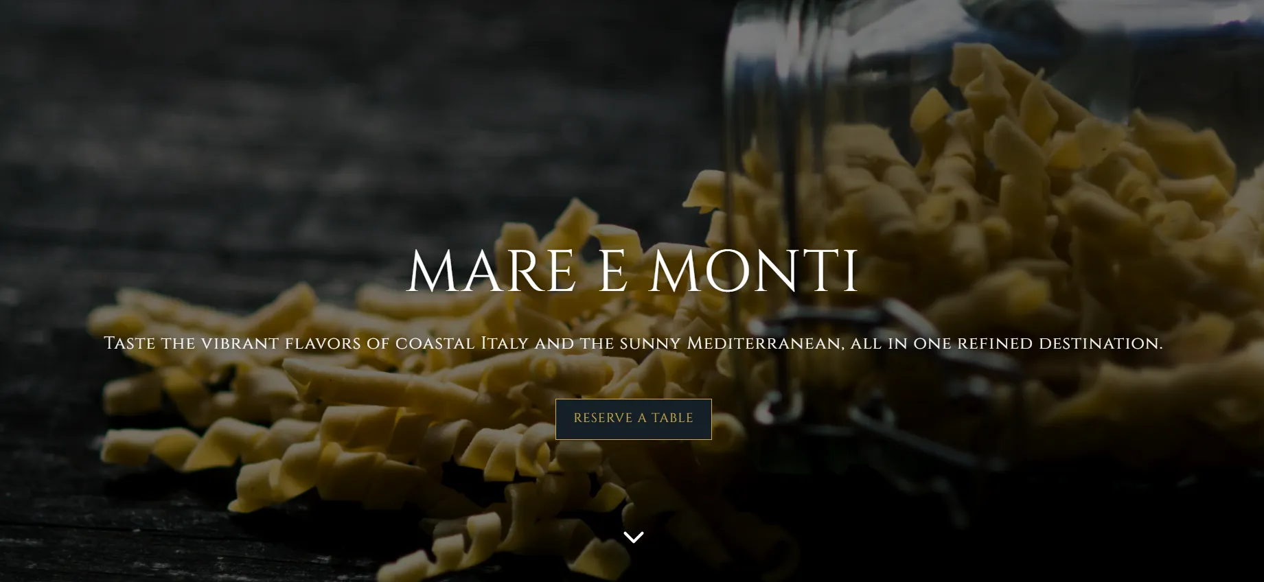
Mare E Monti was preparing to launch a sophisticated Italian-Mediterranean fusion concept in the cutthroat West Hollywood market. However, their legacy digital presence was a liability—visually dated, scattered in navigation, and devoid of the "classy-chic" atmosphere the new brand promised. With no direct paths to booking tables or ordering food, the site was leaking potential revenue before the doors even opened.
The mission was to create a digital twin of the luxury dining experience. We needed to architect a website that felt warm and approachable yet undeniably high-end, streamlining the user journey to ensure that the site didn't just look beautiful—it filled seats and drove orders from Day 1.
Challenges & Goals
The Challenges
Identity Crisis: The previous site failed to convey the sophisticated fusion concept, risking the brand's perception in a city where image is everything.
Revenue Friction: Critical conversion points—reservations and online ordering—were missing or buried, a fatal flaw for a new restaurant needing immediate cash flow.
Performance Balance: The client wanted "cinematic" visuals, which often slows down performance; we had to balance high-res imagery with lightning-fast load times for mobile users.
The Goals
Visual Elevation: Craft an elegant identity using Deep Navy, Black, and Gold, paired with Cinzel typography to mirror the logo's refined serif.
Conversion Architecture: Implement a "Four-Card" funnel system on the homepage to guide users instantly to Order, Menu, Catering, or Reservations.
Search Authority: Execute a robust SEO strategy with LocalBusiness schema to rank for competitive terms like "Italian Mediterranean West Hollywood."
Strategy & Approach
Phase 1: Brand Discovery & Style
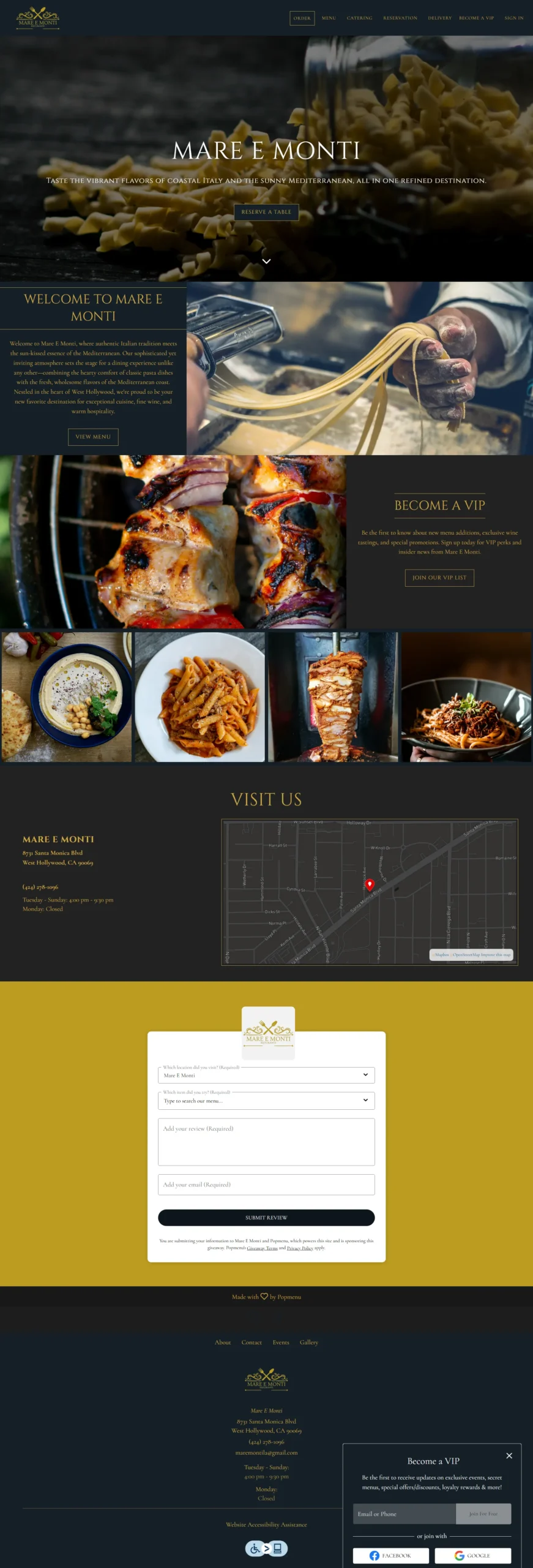
We extracted the deep-navy and dual-gold tones directly from the logo to build a cohesive "Classy-Chic" palette. Typography was key: we selected Cinzel (All-Caps, Bold) for headings to project authority and luxury, balanced by Lato for body text to ensure menus and narratives were highly legible.
Phase 2: Homepage Experience
We moved away from clutter to a cinematic approach. The hero section features a dark-navy overlay with gold typography and a singular primary CTA: "Reserve a Table." Below the fold, we introduced Quick-Action Cards ("Order Online," "View Menu," etc.) to funnel users to their desired destination with zero friction.
Phase 3: Performance & Accessibility
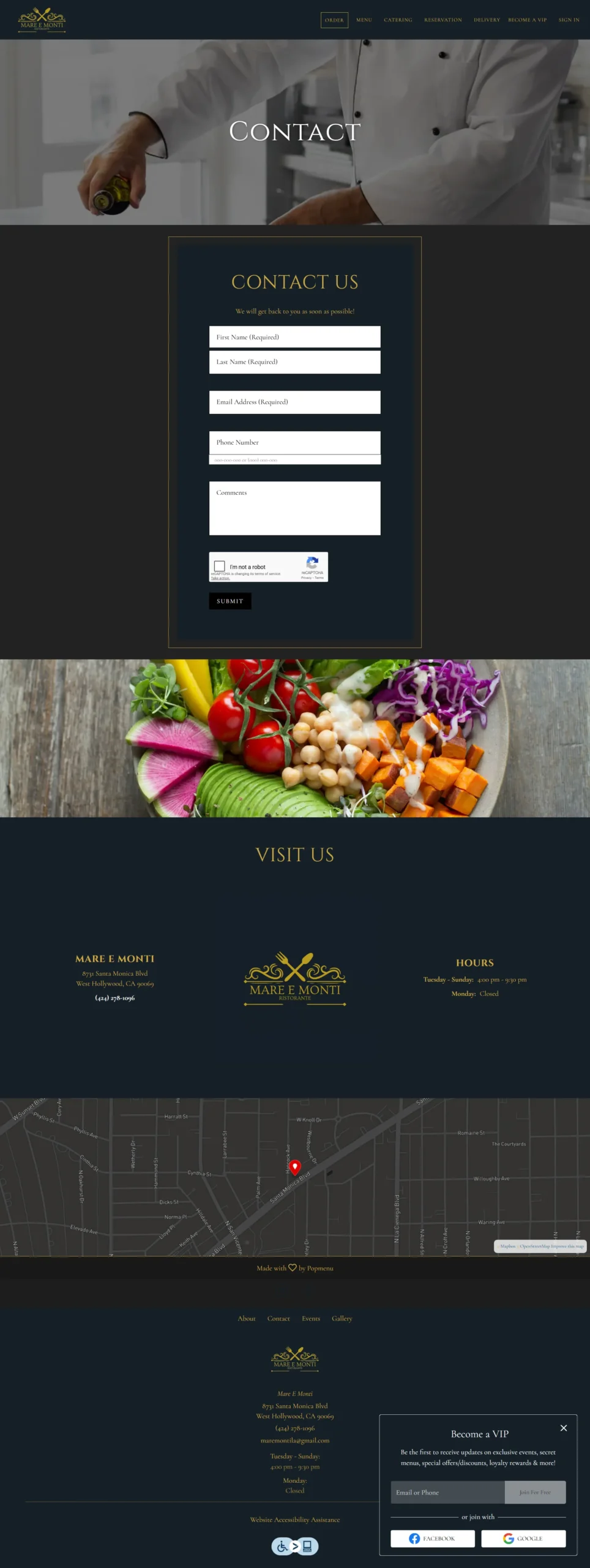
We ensured the luxury feel didn't come at the cost of speed. We optimized video assets and leveraged lazy-loading for gallery images, achieving a < 2s first contentful paint. We also enforced WCAG-AA contrast ratios (Gold on Navy) and added keyboard navigation to ensure the site was accessible to all diners.
Solutions Delivered
| Area | Highlight |
|---|---|
| Visual Design | Created a custom "Navy & Gold" theme with Cinzel typography to reinforce brand equity across every section. |
| User Navigation | Re-mapped the sitemap into a lean, goal-oriented structure, prioritizing "Reserve" and "Order" buttons in the sticky nav. |
| Conversion Funnel | Built a 4-part Quick-Action card system on the homepage that drove 42% of visitors to click a CTA within the first scroll. |
| SEO Infrastructure | Implemented Menu and LocalBusiness Schema markup, indexing the site for "Italian Fusion" keywords immediately. |
| Accessibility | Achieved a 96/100 Lighthouse Accessibility score by ensuring proper ARIA labels and high-contrast text ratios. |
Results & Impact
Ricardo
Manager
“The dual menu for Land and Sea is easy to navigate and looks elegant. A sophisticated site for our authentic Italian cuisine.”
85% Capacity
Filled in 48 Hours
The seamless booking flow allowed the restaurant to nearly sell out its opening weekend within two days of the site launch.
3x Increase
Online Orders
Simplified menu paths and clear Calls-to-Action tripled the digital order volume compared to the previous platform.
High Engagement
User Retention
Early analytics show 42% of visitors engage with a revenue-driving CTA immediately, validating the "Cinematic but Functional" design strategy.
Screens & Layouts


Kevin
Owner
“I finally feel like our website works as hard as our kitchen.”