Status:
Online
Client:
PopMenu
Established:
2025
URL:
Location:
MA, USA
Project Scope:
Website Redesign, Brand Strategy, CSS Architecture, Local SEO

Alvaro Morales
- Residence:Honduras
- City:San Pedro Sula
- Gender:Male
- Age:29
- Spanish:Native
- Englsih:C2 Proficient
- German:B2
- French:A1
Atlantic Poké
Project Overview
Apple-Store Minimalism Meets Ocean Freshness
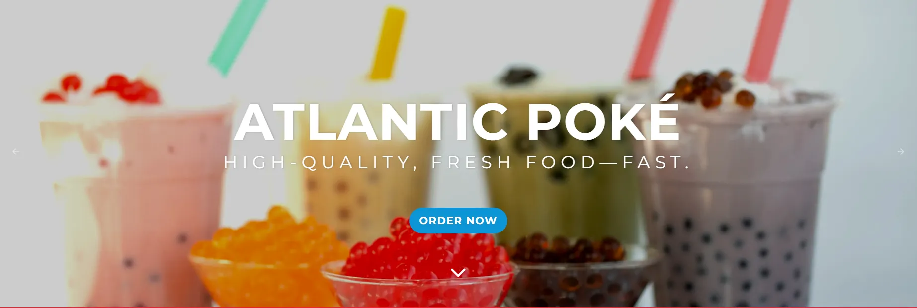
Atlantic Poké serves high-quality, fast-casual bowls and bubble tea across two Massachusetts locations. However, their digital storefront—a dated Wix site relying on stock imagery—was slowing them down. The founders envisioned a brand evolution centered on "freshness, transparency, and speed," aiming for a digital aesthetic that felt like an "Apple store meets the ocean."
The mission was to re-platform and re-engineer. We needed to migrate to a robust CMS while shedding the visual weight of the old site, delivering a lightning-fast, mobile-first experience that prioritized clean geometry, brand-true colors, and seamless online ordering.
Challenges & Goals
The Challenges
Performance Drag: The legacy site suffered from slow mobile load times and relied on generic stock photography, diluting the brand's premium positioning.
Technical Constraints: Implementing a minimalist design within a structured CMS required overriding default styles (like heavy drop shadows and gray buttons) that clashed with the "clean" vision.
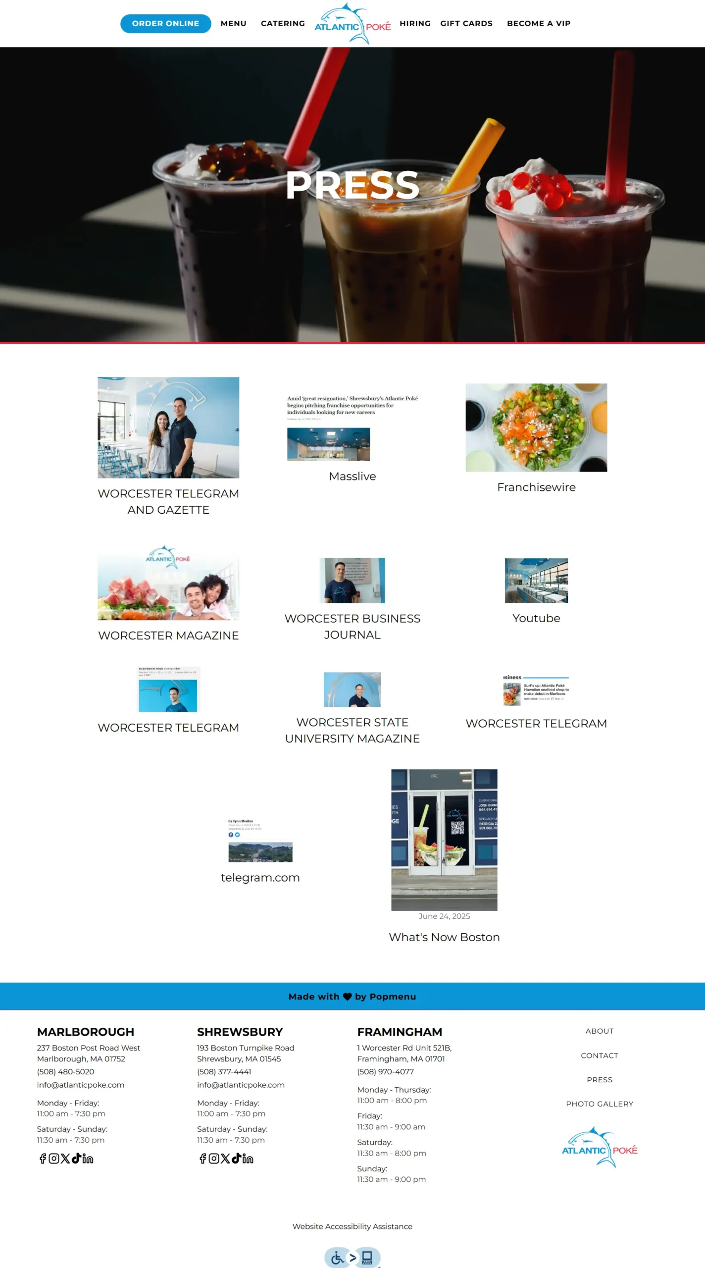
Content Management: The client struggled to showcase recent media buzz, resulting in a Press page that looked cluttered with tiny, cropped thumbnails.
The Goals
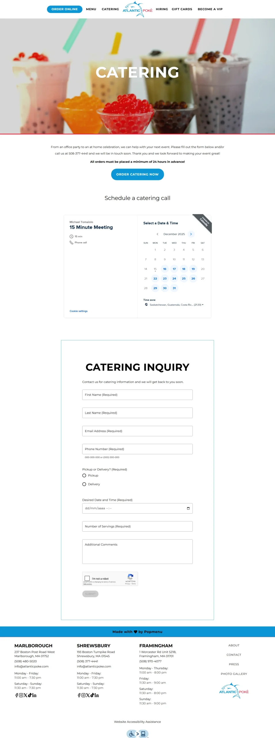
Visual Precision: Execute a design system anchored in ample white space, Ocean Blue (#0C94D5), and Accent Red (#F02137) to mirror the logo.
Technical Excellence: Achieve Lighthouse scores of 97-100 by enforcing strict asset compression, lazy-loading, and CLS (Cumulative Layout Shift) elimination.
Operational Flow: Reduce support tickets regarding menu location and ordering by implementing distinct, high-contrast Calls-to-Action (CTAs).
Strategy & Approach
Phase 1: Brand & Design System
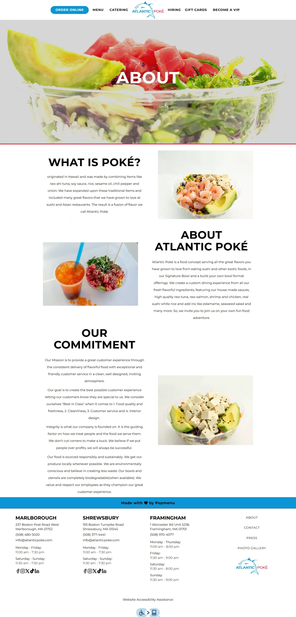
We extracted the core values of "freshness and speed" to inform the UI. I selected Montserrat for headings and Poppins for body copy, mirroring the bold sans-serif of the logo. A mobile-first SASS approach ensured that images remained perfectly centered and scaled at every breakpoint, solving previous layout shifts.
Phase 2: Custom CSS Engineering
To achieve the requested minimalism, I wrote scoped CSS overrides to repaint default CMS elements. This included stripping heavy box shadows from dish cards and forcing buttons to adopt the brand’s #0C94D5 Blue with WCAG-compliant black text, ensuring accessibility without sacrificing style.
Phase 3: Performance & SEO
We optimized the site’s engine by stripping duplicate fonts and compressing hero assets, reducing global page weight by 38%. Simultaneously, we implemented Restaurant and LocalBusiness schema, targeting keywords like "poke in Marlborough" to boost organic visibility immediately upon launch.
Solutions Delivered
| Area | Highlight |
|---|---|
| Visual Design | Implemented a "Clean Geometry" theme using #0C94D5 and #F02137, featuring micro-interactions like subtle hover lifts on hero imagery. |
| CSS Architecture | Engineered tight, scoped CSS rules to remove default platform styling (borders, shadows) while maintaining ARIA accessibility standards. |
| Press Module | Rebuilt the Media page with custom inline dimensions to create a magazine-style grid, replacing tiny, cropped thumbnails. |
| Performance | Achieved a 97-100 Lighthouse Score across all metrics by enforcing fixed aspect ratios and lazy-loading gallery assets. |
| User Experience | Re-engineered all CTAs with consistent brand colors and high-contrast text, significantly reducing user confusion. |
Results & Impact
Russel
“The bowl builder visualizer is interactive and engaging for customers. It’s fresh, modern, and perfectly suited to our concept.”
+22%
Online Orders
In the first 30 days, the mobile-optimized interface and clear navigation drove a significant increase in completed digital transactions.
+54%
Organic Impressions
The implementation of location-specific keywords and Schema markup led to a massive jump in local search visibility.
2x
Engagement Time
The redesigned Press and About pages doubled the average session duration, validating the new content strategy.
Screens & Layouts



Kevin
“I finally feel like our website works as hard as our kitchen.”

