Status:
Online
Client:
PopMenu
Established:
2025
URL:
Location:
GA, USA
Project Scope:
Website Dev & Design, Brand Accessibility Strategy, Custom Form Dev, OLO Integration


Alvaro Morales
I`m a
- Residence:Honduras
- City:San Pedro Sula
- Gender:Male
- Age:29
- Spanish:Native
- English:C2 Proficient
- German:B2
- French:A1
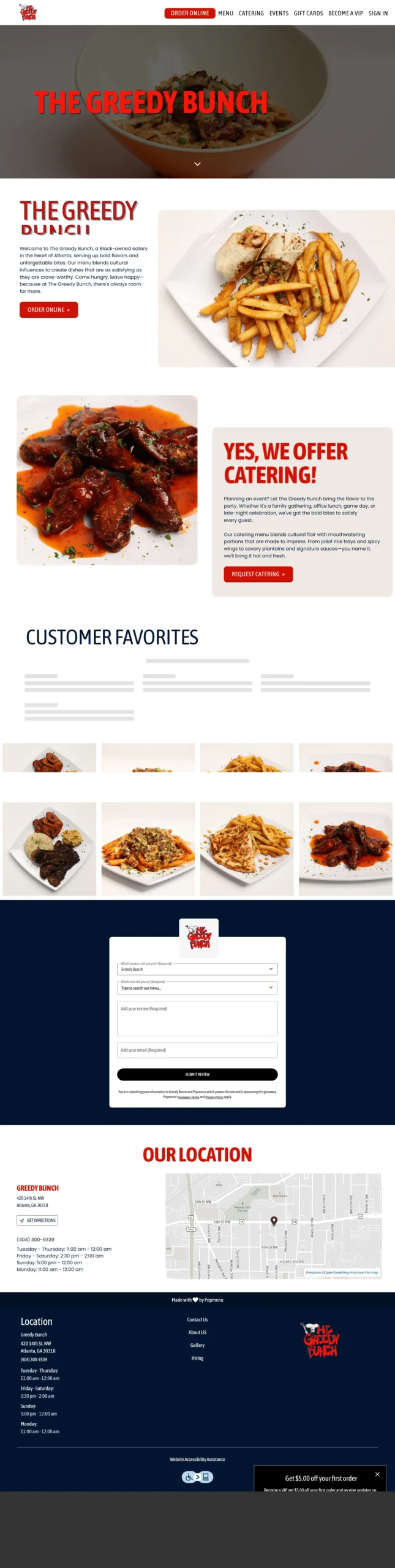
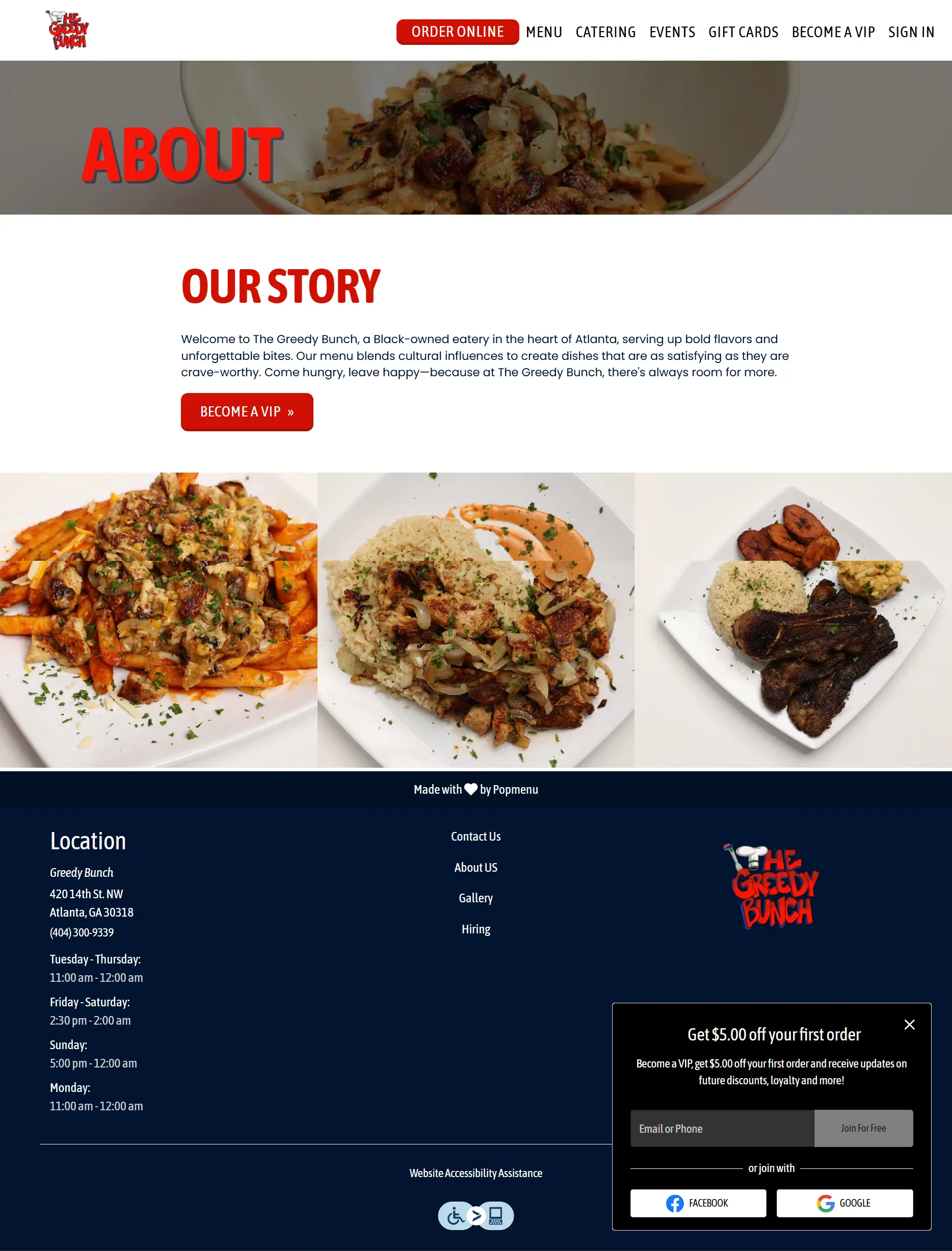
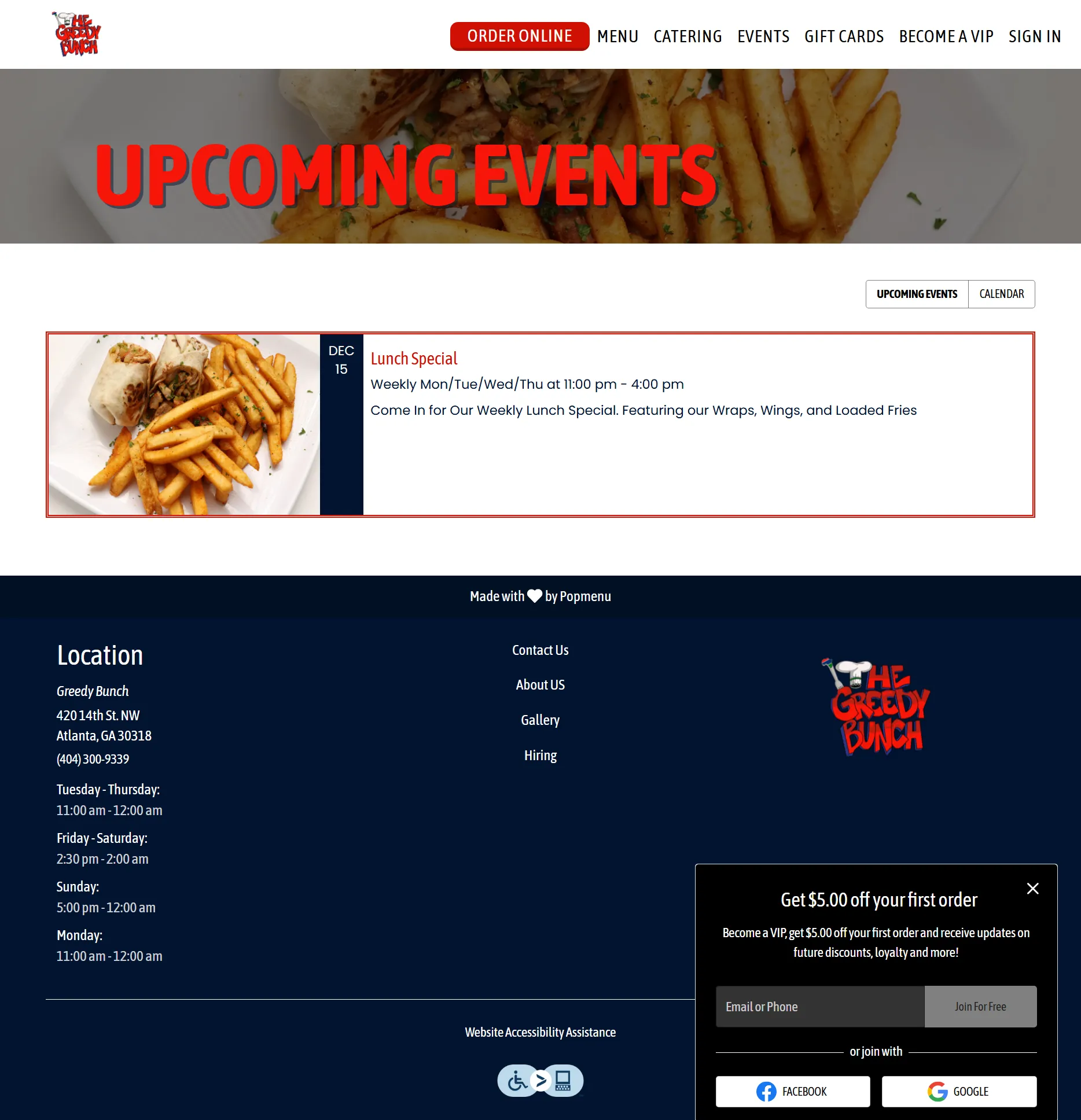
Greedy Bunch
Chicken, eCommerce, Restaurant Sites, Seasonal Food
Results & Impact

Fred
Manager
“The 'Coming Soon' page generated massive hype before we even opened our doors. We hit the ground running with a loyal community already in place.”


Kevin
Owner
“I finally feel like our website works as hard as our kitchen.”