Status:
Online
Client:
PopMenu
Established:
2001
URL:
Location:
FL, USA
Project Scope:
Website Development & Design, SEO Optimization, Online Ordering Integration

Alvaro Morales
I`m a
- Residence:Honduras
- City:San Pedro Sula
- Gender:Male
- Age:29
- Spanish:Native
- English:C2 Proficient
- German:B2
- French:A1
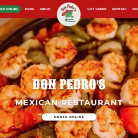
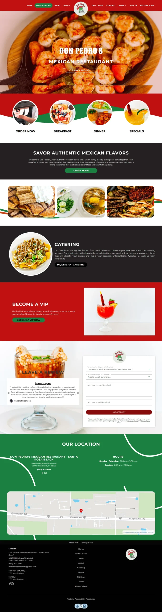
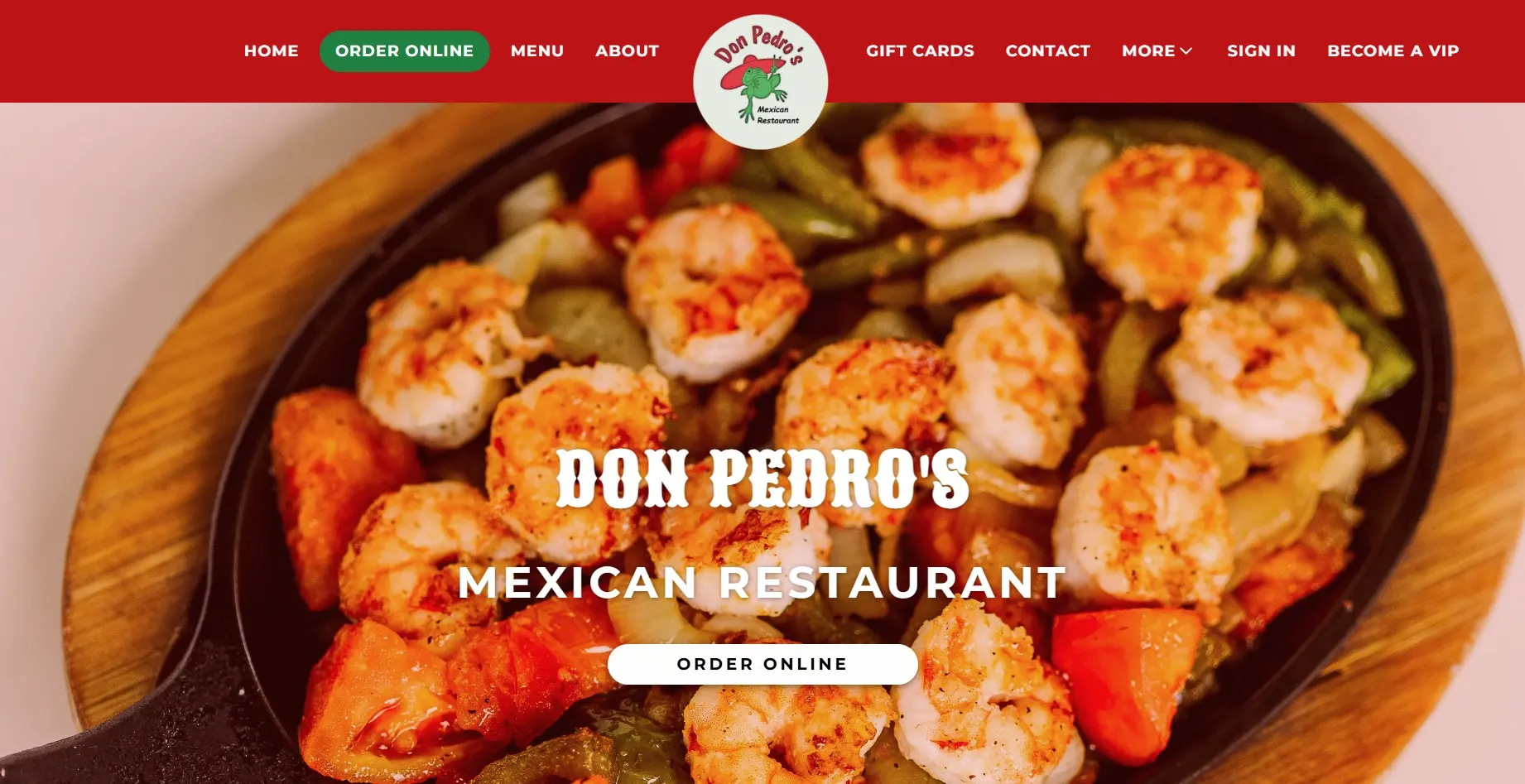
Don Pedro’s Mexican Restaurant
eCommerce, Latino Food, Mexican Food, Restaurant Sites